That Guy

|
This picture is awesome...very cool.
Friday, February 23, 2007 9:33 PM
|
Nikki OLE
Tampa, FL

|
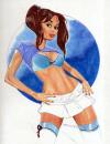
It would've been beautiful if they hadn't done the eyes like that again...and with a different lipstick
Friday, February 23, 2007 9:42 PM
|
CK

|
but the lipstick highlights the ad on the taxi!
[Edited by thisburninghour on 2/23/2007 11:47:34 AM. Reason for edit: h]
Friday, February 23, 2007 9:47 PM
|
Seth Angelus

|
This is more of a constructive criticism of the person who took and designed this photo:
1)NY taxi cabs aren't greenish in any way.
2)The liptick is tacky looking.
3)The dress is fine, but the transparent bag freaks me the FUCK OUT because it's like it's there....and not...at the same time.
So in conclusion here is my fixed version of the same pic. Tell me what you think.

Friday, February 23, 2007 10:04 PM
|
TrackStar

|
I like the picture(the original) and I think the eyes are nice and that the greenish tint is good for the taxi's because they not only highlight the dress but they are less harsh on the eyes. Yellow is to abrubt in a darkened image like this.
Friday, February 23, 2007 10:07 PM
|
Seth Angelus
|
Green taxis are harsh on the eyes, Nick.
Friday, February 23, 2007 10:08 PM
|
TrackStar
|
not when you live in new york and all you see is yellow ones. Greens a fresh look.
Friday, February 23, 2007 10:18 PM
|
Seth Angelus
|
My version at least captures the true essence of New York.
Yellow Taxis and an omnipotent cougar spirit.
Friday, February 23, 2007 10:20 PM
|
ATLDrtybird7
|
^ i have to agree, the cougar adds a little something to the picture that is hard to describe with words, but it certainly makes this ad one of the more exciting ones i have seen.
Friday, February 23, 2007 10:33 PM
|
TrackStar
|
like shes gonna get eaten... out...
shes fierce. she is tigress
[Edited by TrackStar on 2/23/2007 12:34:49 PM. Reason for edit: []
Friday, February 23, 2007 10:34 PM
|
Nikki OLE
Tampa, FL
|
Grr, I just keep looking at it and thinking how much nicer it would've been with her actual eye color and maybe some red lipstick
Friday, February 23, 2007 10:56 PM
|
ATLDrtybird7
|
nevermind all that, just focus on the cougar
Friday, February 23, 2007 11:14 PM
|
Incognito
|
LoL it's supposed to be all symbolic and shit....green...the color of money and envy...etc
Saturday, February 24, 2007 1:21 AM
|
Dongsy Normus

|
amazing what photoshop can do

oh snap
[Edited by calvin on 2/23/2007 5:49:50 PM. Reason for edit: a]
Saturday, February 24, 2007 3:49 AM
|
Incognito
|
LoL--photochop, making chubby ugly chix look halfway decent since 1995. I totally wish I looked digitally reconstructed all the time .gif)
[Edited by Incognito on 2/23/2007 5:55:25 PM. Reason for edit: ?]
Saturday, February 24, 2007 3:54 AM
|
TrackStar
|
God forbid calvin read any of the pictures and figure out that she was recovering from 2 broken backs at the time... yea, youd be out of shape too.
Saturday, February 24, 2007 4:21 AM
|
Liquid Anubis

|
Hmm, I'm not feeling the tree or the transparent bag.
Saturday, February 24, 2007 5:50 AM
|
Dongsy Normus
|
^^jesus TWO BROKEN BACKS? god only gifted me with one back and heaven forbid i should break just that one!
Saturday, February 24, 2007 7:39 PM
|
blahblahblah

|
lol @ 2 broken backs
Saturday, February 24, 2007 8:10 PM
|
TrackStar
|
Grammatically there is nothing wrong with what I said. You've just decided on your own to suck at life.
Saturday, February 24, 2007 11:54 PM
|
blahblahblah
|
grammatically it's fine...physically it's impossible
and advertising wise..i am not sure i like this ad because the lips are what you look at first and it doesn't draw your eyes to the logo/company's name
[Edited by blahblahblah on 2/24/2007 3:55:50 PM. Reason for edit: .]
Sunday, February 25, 2007 1:54 AM
|
Incognito
|
I think he means I broke my back on two separate occasions--and when the second set of fractures occured the first ones had not yet healed. I think the lipstick works well because it steals attention--which plays on the themes the piece is trying to convey--self centerdness, envy, greed--even the bag is transparent because the point of wearing name brands is to draw attention to oneself.
Sunday, February 25, 2007 3:13 AM
|
the dude

|
What about the whales in the lipstick and the Chinese died building those buildings?
Sunday, February 25, 2007 3:37 AM
|
JC
Tampa, FL
|
Blame it on the cougar.
Sunday, February 25, 2007 4:55 AM
|
Liquid Anubis
|
I thought the ad was going for cool effects. But then again, this ad would be in one of those fashion/modeling magazines, so I wouldn't get it.
Sunday, February 25, 2007 6:19 AM
|
blahblahblah
|
quote :
I think the lipstick works well because it steals attention--which plays on the themes the piece is trying to convey--self centerdness, envy, greed--even the bag is transparent because the point of wearing name brands is to draw attention to oneself. |
i understand all that, but if the audience doesn't even see the "me & i" then the ad is worthless
Sunday, February 25, 2007 8:41 AM
|
Liquid Anubis
|
The text was the last thing I saw. The tree=no.
Sunday, February 25, 2007 9:22 AM
|
Dongsy Normus
|
the tree is out of place, the bag is confusing, the harsh green steals the show, your lips look like you've been huffing co2 balloons and I didnt even notice the logo
very forgettable
Sunday, February 25, 2007 9:51 AM
|
Seth Angelus
|
I'm sure there are other reasons you didn't notice the logo.
Sunday, February 25, 2007 9:57 AM
|
TrackStar
|
I think you all are missing the point... its an artistic piece, not an ad.
Sunday, February 25, 2007 10:33 AM
|
Seth Angelus
|
Yeah, where the hell does it say this is an ad.
Sunday, February 25, 2007 10:45 AM
|
yuinamyen
Tampa, FL

|
pretty much fag.
Sunday, February 25, 2007 12:00 PM
|
blahblahblah
|
i assumed since it had the designers name/logo that it was an ad...why would anyone think it's an "artistic peice"
Sunday, February 25, 2007 6:18 PM
|
Seth Angelus
|
This has the designer's name and logo on it. Does that make this an ad?
Sunday, February 25, 2007 6:42 PM
|
shchmue
Tampa

|
you guys didn't read the post in the other picture thread i guess. this is all part of some big project for some shitty religious website.
Sunday, February 25, 2007 8:58 PM
|
blahblahblah
|
^^that's obviously the front page of a magazine/comic book/whatever...but yes even the front page is an advertisement to entice someone to buy it
Sunday, February 25, 2007 9:47 PM
|
Dongsy Normus
|
it has a logo "Ny italy gayville" why wouldnt I think it was a designer?
looks like a trashy version of high fashion
Monday, February 26, 2007 8:46 AM
|
TrackStar
|
lol...
your always reaching so hard...
Monday, February 26, 2007 11:29 AM
|